How did you use media technologies in the construction and research?
- When I started the A2 course in September I and my other group members found the technology aspect of the coursework challenging.
- We designed our blog with our own backgroup of the artist and changed the layout fit our background.
- This helped our group a lot this year in the construction and research process of our course work. In our advance construction we used more tools from Adobe premiere CS6 sofware that were in our disposal to edit footages. We used effects such as Mirror to duplicate the performers and play with the audience's eyes.
- We used transitions such as fade to help narrate our music video, for example when the artist is dressing the fade transition showed time elapsed.
- The main thing that Adobe premeir helped us to contruct our music video is allowing us to cut various clips, move them around to sync to the music so it looked like she was singing.

- It has been challenging but important in the processes of creating a music video for example slowing down the footage and speeding up the footage is an effect on adobe premier to go with the music rhythm. That has been useful in the creation of our music video, we also learnt how to transfer footage from the camera to the Adobe premiere software by capturing and saving how work on the computer.
- Our mobile phones where helpful to record and take pictures when researching, we was then able to upload to the computer by email and google drive.
- Google drive is a new online storage where we kept many of our files such as video clips, images, sounds and more

- Youtube was also another important media technology that aided us to brainstorm ideas for our music video. Before Youtube was established in 2005 Media students did not have access to music video's like today.
- Media teachers had to record music videos on MTV and bring it into class for media students to watch and analysis the music video. Unlike today through Youtube we can watch every music video that traces back to the beginning of hip pop or the pop genre on Youtube.
- We used YouTube to carry research of similar text such as music videos from pop artist, we also used it for uploading our work to obtain feedback from a wide audience.
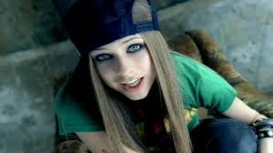
- Through the use of Technology convergence music video is now accessible on (I-phone, PS3, XBOX, I-pad etc) to different people on a larger scale. This has made it easier to analysis different music videos specifically in the pop genre like Avril Lavigne, Jessie J, MIA, Lady gaga, Cher Lloyd and Beyonce etc. We used an I-phone to take pictures of possible location as we explored the city. This has been very useful in the planning and research part of our course work
- Along side this we used Facebook and Instagram to ask friends to participate in our questionnaire for research and also to upload our music video for audience feedback. We received helpful suggestion for example adding more transitions such as 3D and fade.

- This has enabled us to come to grasp with codes and conventions of the pop genre and how the representation is being constructed in pop music videos.
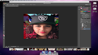
- Adobe Photoshop 6 was also been useful in establishing and promoting our artist. At first it was quite difficult to figure it out but after playing around with it, it became easier to use.
- For example the Magic Wand allowed me to erase backgrounds from images like the green wall and add different layers to produce our digipack.
- We manipulated the brighness to get rid of shadows around the artist for the magazine Ad.

- Using the green room helped us make how CD-cover and magazine cover by cropping out the picture of our artist and inserting it with another picture through the use of Adobe Photoshop 6.


- Adobe Photoshop was also useful because it had a lot of different font choices which was helpful in picking out the style of font for our CD cover title and the name of the artist.
- I was able to figure out what font to use by searching on Google and creating our own font on Bingfont and downloading it. I imported to Photoshop and thats how we various fonts.
- Below is the rusty bold font we imported and you can see transparant buildings ton he font.


- We couldnt have produced any of this work without a the Mac desktop. This was helpful because of the features it had such as uploading videos, new Adobe premier, photoshop, Screen recording (researching), screen prints(documenting our work) and CD rom which enables us to burn the music video.

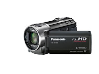
- We used a Panasonic V700 which was HD and had playback capability on the screen. This was useful when filming because we could play back quickly and see if needed to reshoot.
- Its high resolution and good zoom-ing was useful when shooting close up at the artist, for example in the basketball scene when she is close up singing.
- We used zoom in and out many times like in the last scene at the bar when we shot zoomed in at the artist face and pulled back.
In what ways does your media product use, develop or challenge forms and conventions of real media products?
Our music
video has followed some forms of code and convention for example editing to the beat, miming to the
lyrics, narration but has also challenged codes of conventions in the pop genre
for example non voyeuristic view of the artist. We have developed forms and
conventions of real media products for example our Digipak, Poster and music
video run a theme of the artist's style and character. To begin,
I’m going to discuss how our media product has used forms and conventions of
real media products.
We have designed a digipak very professionally like all digipaks in the market. In our digipak the artist is at the front standing above London city with the name of the album and the artist. These are conventions for CD covers/digipaks because the audience/customers need to know what they are buying. We have used Adobe Photoshop 6 to design, layer, decorate our digipak professionally, create a logo, add a Barcode and advisory content logo ETC like a real digipak. One of the main conventions we followed was running a theme through our music video, digipak and magazine advert so the audience can recognise the artist giving her an identity. For example Rita Ora has a theme that runs through most of her media products which is her urban sexy look. This is identified by her red lipstick, blond curly hair, wholly hat, jewellery and light make-up. Our artist has a theme of an urban style running through which is her curly brown hair, red lipstick, snap back hats, dark eyeliner, Dr Dre Beats headsets and light make up. We used this style and costumes because that dress code is associated with urban street which i have describe thoroughly In ‘costumes’ research. On the digipak she is wearing a snap back hat, jeans, grey jumper, Dr Dre beats, light make up and red lipstick. This is similarly carried out in our music video for example in the basket ball court scene she is all in red wearing a red tracksuit, red new era hat, gold watch, light make up. In the last scene she has her hair curly and wearing red lipstick and light make up. The artist style and character also runs through the magazine advert because she is dressed in a street dress code. In the background of the magazine add you can see council estate flats on a sunny day. That also enforces the street looks the artist is going for, The background of the add is in the same location we filmed our basketball scene.
We have designed a digipak very professionally like all digipaks in the market. In our digipak the artist is at the front standing above London city with the name of the album and the artist. These are conventions for CD covers/digipaks because the audience/customers need to know what they are buying. We have used Adobe Photoshop 6 to design, layer, decorate our digipak professionally, create a logo, add a Barcode and advisory content logo ETC like a real digipak. One of the main conventions we followed was running a theme through our music video, digipak and magazine advert so the audience can recognise the artist giving her an identity. For example Rita Ora has a theme that runs through most of her media products which is her urban sexy look. This is identified by her red lipstick, blond curly hair, wholly hat, jewellery and light make-up. Our artist has a theme of an urban style running through which is her curly brown hair, red lipstick, snap back hats, dark eyeliner, Dr Dre Beats headsets and light make up. We used this style and costumes because that dress code is associated with urban street which i have describe thoroughly In ‘costumes’ research. On the digipak she is wearing a snap back hat, jeans, grey jumper, Dr Dre beats, light make up and red lipstick. This is similarly carried out in our music video for example in the basket ball court scene she is all in red wearing a red tracksuit, red new era hat, gold watch, light make up. In the last scene she has her hair curly and wearing red lipstick and light make up. The artist style and character also runs through the magazine advert because she is dressed in a street dress code. In the background of the magazine add you can see council estate flats on a sunny day. That also enforces the street looks the artist is going for, The background of the add is in the same location we filmed our basketball scene.
we have followed the conventions of pop music videos because there is a narration, main artist, break dance performance, different locations and more. We wanted our music video to show how different teenage groups relate to each other and those who like hanging out with friends and having fun so we used a narration. Its about a girl who gets out of bed from last night party and her friends invite her to go out by text, the following scene shows what she likes doing during her spare time which was to go skate park with her friends doing tricks, it then went on showing her in a basketball court with her friends playing around having fun. The last seen is at a bar with her friends drinking, dancing and socializing. we followed the code of convention by having performance for example BMX tricks and skateboarding like in the video of Avril Lavigne who's one the artist we looked into. This performance associates with punk because the artist is representing a punk character for that scene. We used some break dancing performance in the skate park because the graffiti all over the walls links to break dancing since they are both associated with urban and performance art. This was inspired by Jessie J music video "Do it like a dude" along side Rita Ora "Hot right now" pop songs which both had a lot of urban break dancing. In almost every pop music video the artist changes costumes more than 3 times because its more interesting and spontaneous because its boring if you watch a 3 minutes music video and the artist only wears one costume and stays in the same location. For example Tulisa "Young" music video she wears 7 different costumes each in different location like on the beach, bar, gallery, villa, street and more . So we changed the artist costume 5 times with each costume linking to the location for example at the basket ball court she was wearing a track suite, new era hat and light make up because she is in a tom boy character in that scene. This helped our music videos narration to be more realistic and also fun because we are showing time elapsing and not just one long scene. Our young target audience of teenage girls enjoy glamorous, exciting and music videos so its important we used this convention. We used 5 locations in our music video beginning at the artist's (Sonika) bedroom to South bank Skatepark, basketball court, bar and green room. Having different location was important for our narration because we needed to show what she did and where she was going through her spare time. likewise will Tulisa music video "Young" the location made it easier for me to understand the story and her lifestyle.
lyrics: You know you're only in it Cuz it's hot right now, hot right nowTurn it up right now
Put your hands in the air if you want it right now
Eh oh eh oh hot right now, You know you're only in it
Cuz it's hot right now, hot right now, Turn it up right now
Put your hands in the air if you want it right now
Eh oh eh oh hot right now
We followed the convention of linking the lyrics with the visual and artist for example at the bar scene near the end of our video sonika used her hand to blow her face suggesting its hot linking to the lyrics "Hot right now". She also uses her finger pointing up to link to the lyrics "Turn it up right now". This use of linking lyrics and visual is used in many pop music videos for example Jessie J- "do it like a dude" and more. This technique helped us emphasize the narration of the music video.
Music/Editing
Another convention we followed was linking music to editing so our music video is more interesting to watch. We wanted to emphasize the music during some part for example just before the chorus you hear fast drums then "bang" the chorus starts. So we used this effect called strobe on Adobe Premier so what it does is it creates fast flashing white lights which go on and off multiple times at fast paste matching the drumming paste. That technique enforces the music video and makes it lively because the links between the lyrics, visual and music. We also edited to the music after the second chorus because the music slows right down for some seconds and we used the slow motion effect to slow down the video which worked well with the paste. The video would of looked odd if the video was still at normal past.
Camera work
- We used camera work to emphasize some props and actions by zooming in, camera movement and angle. In the scene where the artist is putting on her make up we zoomed in to show its her red lipstick which is a theme that runs through all our media work. When Sonika checks her phone we zoomed in to show the audience what the message on her phone says so we are inviting the audience. This technique is used in many pop music video to support the narration for example Avril lavigne - Sk8ter boi video when the camera zooms in at the computer to show the concert date. At the beginning of the video we use a Pan movement to show the state of the bedroom as the artist is sleeping after a night out. This shows the clothes on the floor and shoes to tell the audience what kind of person she is. We used various angles for example low, high, birds eye and more. The low angle creates a live stage performance as the artist is looked up by the audience, This convention is used many times in Jessie J video-do it like a dude. We also used birds eye view in the basketball court to make the audience feel like they are being floating around.
Intertexuality
- our music video wasn't based on any other real music video but highly influenced by Rita Ora- 'Hot right now' music video where we got the soundtrack from. We followed some of the codes and convention of pop and Rita ora for example featuring break dancing, tricks, fast cuts, street wear costume, urban location and the narration of friends meeting up to hang out and have fun like in Hot right know music video.


- Laura Mulvey's Theory is that "because the filmmakers are predominantly male, the presence of women in films is often solely for the purposes of display" -quote. The purpose of this is to create a voyeuristic response from the audience. Mulvey's theory also believe women are not displayed for the narrative but we have used a female artist for the whole narrative.
- The camera crew consisted of just men because we only had one girl in our group and who was the actress/artist. We didn't create any voyeuristic view of the artist because we don't want our teenage female girls to feel they should behave in that way or attract a male gaze. This also challenges Andrew Goodwin's theory that women are displayed to be objectified by the use of editing and camera work because we didn't use any editing/camera work to sexualise our artist or try to attract a male gaze.
How effective is the combination of your main product and ancillary texts?
city/urban theme/Location
- The first thing that shows the link between my music video and ancillary text is the urban theme which is seen in the locations in our music video and on the digipak plus the magazine advert. The combination of the urban theme in our music video and the ancillary text works well and associates our artist with an urban lifestyle. This works well because it supports our target audience who are teenage girls who live in a city. We showed this theme by using an aerial shot of London city for the back and front cover of our digipak. We linked it to our magazine advert which the background is of Shoreditch estate in London. This links to our music video because we filmed the basketball scene in that same location in Shoreditch where the magazine advert background is. So when the audience watches the music video they will recognize the buildings and basketball court from the video which the images are used for the inside of our digipak and on magazine advert.

Costume

- Costume is one of the most important elements for our music video and ancillary text because our artist's costume tells the audience what type of person she is and part of her identity is shown by her costume. As you have seen in our music video our artist changed costume numerous times, at the basketball scene she wears a red tracksuit and a red baseball hat. In the skate park the artist is wearing blue jeans, black Adidas track top and at the party scene she is wearing new the end of our music video. At the basketball court and skate park you can see that we created an urban look for the artist for which we have linked to our digipak where the artist is wearing a black baseball hat, blue jeans and a grey jumper. The magazine advert costume is the same as the digipak which is supporting the teenage urban look. This costume associates the artist with urban lifestyle like the locations but also creates a character the audience will recognise and remember about our artist.
- Her curley hairstyle is part of her identity and stands out through out her music video, digipak and magazine advert. This is effective because it gives the audience something to remember the artist with and recognise her from adverts and digipak. This was influenced by Rita Ora's curly blond hair which runs through most of her media work.

- Our aim was to use light make-up so we didn't encourage our audience to wear heavy make or feel they had to so strongly. The artist has used red lipstick and black eyeliner in our music video when she gets up in her room she puts her make up on. She also is seen wearing red lipstick at the party scene at the end. We have linked this red lipstick to our magazine advert and digipak were the artist is wearing red lipstick. This worked well and is effective because it is something that her audience will recognise through all her media products.


- We used a font called CF-old lithography and City Scape because they linked to the urban theme we wanted to create. CF-old had an eroding effect like when paint is eroding from a wall for example graffiti spray paint. We used CF-old on our magazine advert because the font linked to the graffiti in the skate park from the music video and the inside of our digipak. City Scape was similar to CF-old Lithography but had small city buildings on the letters which enforced our urban theme. The magazine advert had the text in red because it linked to the artist lipstick on the cover and in the music video. On the front cover of our digipak we used City Scape font in black to link to the artist black hat
- Inside our digipak you can see there is a graffiti background on the CD holder. This links to our music video scene in Southbank Skate park which is covered in graffiti everywhere.We think this works well because our target audience are teenage girls and this is the stage where many people begin to rebel against the status quo, parents etc. Graffiti is a form of rebellion against the order/government but also a form of art.

What have you learn't from your audience feedback?
These are links to audience feedback videos. Please click.
http://www.youtube.com/watch?v=AP-uvO_2N5M
http://www.youtube.com/watch?v=MhuKawS8bU4
http://www.youtube.com/watch?v=urGe0GMY0VM

These are links to audience feedback videos. Please click.
http://www.youtube.com/watch?v=AP-uvO_2N5M
http://www.youtube.com/watch?v=MhuKawS8bU4
http://www.youtube.com/watch?v=urGe0GMY0VM

- We first created this Digipak cover to experiment on Photoshop CS6 software and also get feedback from the audience to learn new things. The first comment we received from people was that it was colourful and appeals to girls who are our target audience but they also said it looked too simple. People suggested we added barcode, logo, side banner and changed the background. We agreed to make changes to our front cover of our digipak and make it stand out. one of the people said the title was not clear enough and it was just to colourful and too much pink. One of the positive feedback was the colour of the font linked well with the artist lipstick.
- We then made changes to the front cover of our digipak to look like this.

- The colours of the font links to the artist's black hat so there's some matching going on in the front cover which people from our feedback liked how the pink font and lipstick of the the artist in our previous digipak cover. We have changed the costume but kept the urban style dress code by dressing the artist with a baseball hat, sports jumper, and you Dr Dre Headphones.
- We changed the background to an areal view of London city to associate our artist with the urban lifestyle. The font we have used is called city scape. If you look carefully at the bottom of each letter you can see buildings in contrast of the black font. This enforces our urban theme. The font also looks as if its eroding like paint on the wall which links to our 'parental advisory' logo at the bottom. This effect links to the graffiti background inside our digipak and the graffiti in our music video in the skate-park.
- We used black for the artist name and white for the album name so it stands out more because of the contrast in colours. We used a clear font for the tittle because some of the feedback suggested to make it easy to read the tittle

- The feedback from the audience recommended we added a logo which you can see we now have and its on the top right corner. The logo says 'All Stars Record' and this links to the artist jumper which says 'All Stars'. The light bulb indicates being smart for example in cartoons light bulb pops up when someone comes up with a good idea etc. The means our record label are intelligent and we come up with genius ideas and great music.
- We used a bar code and placed it on the back of the digipak where they are usually found in real digipaks/CD's. We have also learned from our audience that they wanted to see images of the artist on the back cover with the track list which we have include. We have also included featuring artist like in original Digipak track lists. We added a side banner which our feedback suggested and used the same font as on the front cover.

- Some of our feedback suggested we added some information about the artist music events and websites. So we came up with Tour dates and locations ideal for a pop artist to perform such as the o2 Arena in London. We have put down websites for the artist, record label and MTV who are the tour sponsor. Because we feedback from the audience suggested more pictures of the artist, we used the artist in 5 out of 6 pages in our digipak carrying the same costume throughout. MTV was the ideal sponsor because of the popularity and huge target audience for the pop music/artist they promote on their websites/channels. We have used bird eye shot of the city because we want to carry on the urban city theme throughout the digipak.

- We when around and asked people from our college and outside in the streets who were in our target audience age range to give us a feedback on our music video. We received many good comments about our music video for example how we used good locations which were realistic for teenagers to hang out and liked our costumes. One particular audience said she recognized Southbank Skatepark because she has been there. That was our aim to get the audience to relate to our locations in the music video
- On the other hand the feedback also mentioned that our music video could add a few more variety shots, camera movement and different angles to show the bedroom scene at the start of the music video. They wanted to see what her bedroom was like since she is a teenage girl like our target audience. So we added a pan camera movement at a low angle to show the clothes on the floor and a tilt movement move up and show the artist waking up. This made a difference because at first we only had medium, long shot zooming in to the artist phone showing her about to grab it then the camera pulls back. Another audience 'Jade' said it looked a bit like her own messy room with all the make up, perfume on top of her draw board.


- Our feedback suggested that we made the editing link to the music more in the chorus because the music beat picks up quicker. Before in the chorus each shot was 5-7 seconds long and it didn't link to the paste of the music during the chorus so we cut the shots to 1-3 seconds long and some even a second or a split second so we keep the audience alert rather then bored. This was for example in southbank Skatepark scene were we have a break dancing performance. We cut the shots shorter and used speed up and slow motion effect to rejuvenate and liven the scene. Like when the break dancer is doing a crab move we fast forward it a bit to look exciting and energetic. We added more effects on to the basketball scene for example mirror effect to multiply Laurence spinning the ball and we also used an effect called invert which saturate the colour and creates an contrast effect.


- We was also told by from our feedback that we needed more special effect transitions from one scene to another because it was straight forward without the effect. We found cool transitions such as a 3D transition which spins the shot around and we used it when the biker spins in the air to link both the visual with the editing. This really impressed and wowed our audience later. We incorporated a special transition from each scene to another like a drop, push, diamond cut-in, fade, and a letter box.


- Before our feedback we sped up the break dancer too often and our audience feedback suggested we removed some speed effect so we changed it and used slow motion for example when the dancer spins on his head. Because we filmed many footage of the break dancer we was able to add more footage when editing instead of re-shooting. The thing that took time and care was linking the dance moves so it looked good and made sense so we watched Rita Ora's music video 'Hot Right Now' to see how the break dancers moves flowed well.
- It wasn't just the audience wanting to see more break dance, they suggested we added more bike tricks and skateboarding because it was impressing and kept them on watching. So we added shots of the bikers doing 360 in the air when the artist is singing, Skateboard kick flicks, wheely's and used slow motion to emphasize the tricks. We have seen mixed performances like this in Avril Lavigne music video-'Complicated'.


- Apart from the first scene the audience feedback commented that we could add more variety shots in the basketball scene, party and skate park. We though about other shots we didn't use already because we already had quite a variety. So we added a bird eye view shot of the artist looking up as if its a security camera looking at her. This can relate to teenagers who feel they surveilled often by parents or police etc.

- At the party scene we added high angle from the right to the left and straight ahead facing the artist. In the party scene we ended up with 7 different shot angles and distance. This made it more fun and interesting for the audience to watch. Here's a thew images from the music video.


Thank you for viewing our blog and I hope you have enjoyed the journey through our planing and research, evaluation, ancillary text and finally our Music video. The people Involved in the construction of all the work on this blog are Sacre , Sonika, Laurence and Minhazur.


